The app kept moving and shipping new features, but people weren't treating it as a storage app: most who signed up never actually stored anything there. The brief was to figure out why, and ship functionality that would move two concrete numbers:
Increase the share of registered users who downloaded at least one file from 8% to 30%.
Achieve an average download size of 100 MB per user
I was one of two designers, and we did one of the first real blockchain storage services on the market, paid for in crypto and fiat with no single data center behind it. What was included in my responsibilities:
- UX research and competitive analysis, based on the market and users of the DAO Project, as well as the founder's vision in a proven direction for product development
- Designed the full mobile app experience: built new product flows end‑to‑end, ran usability tests
- Built and maintained the design system, working closely with the Developer to keep components implementation‑ready and consistent as the app grew
- Designed landing pages and marketing graphics for Instagram, Google Ads, and Telegram that helped grow the project's visibility
- Introduced cash payments via Apple Pay in the crypto project: this was also quite challenging from a technical standpoint, but we managed to do it
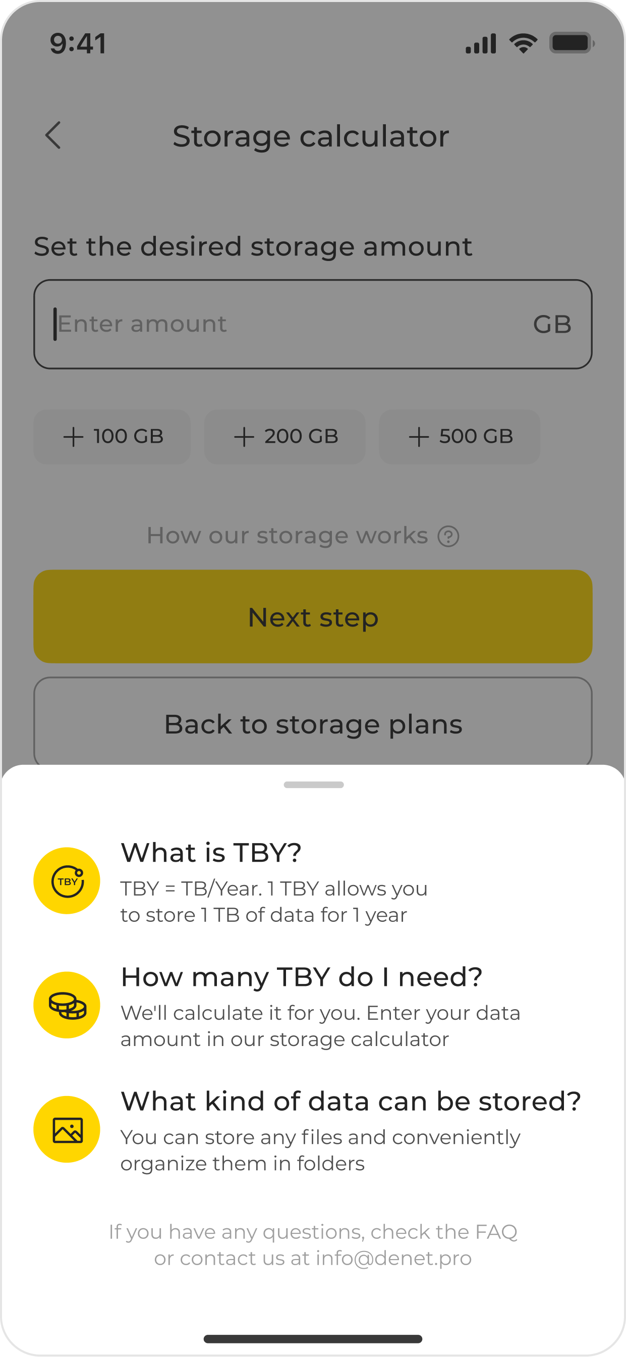
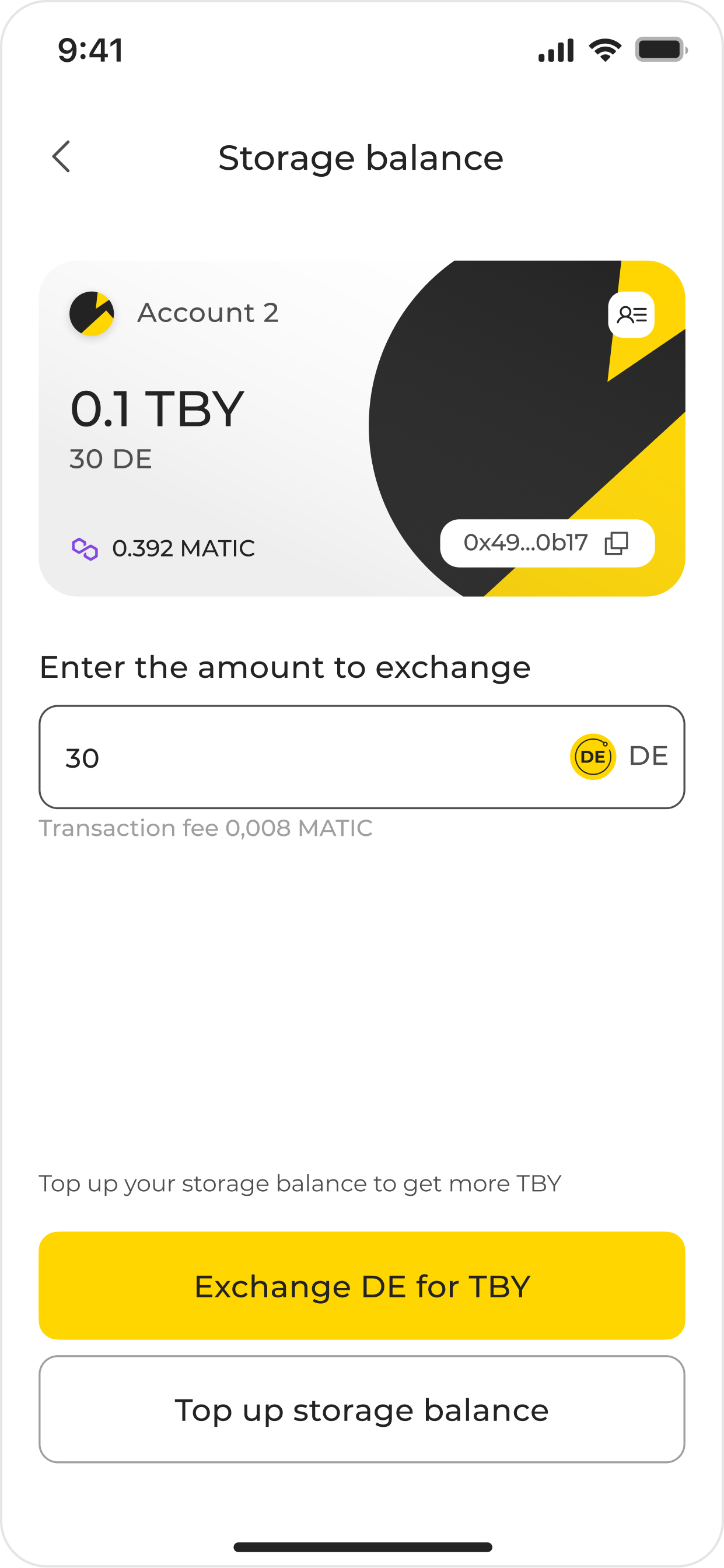
cryptocurrency holding balance: users were explained how the holding token works
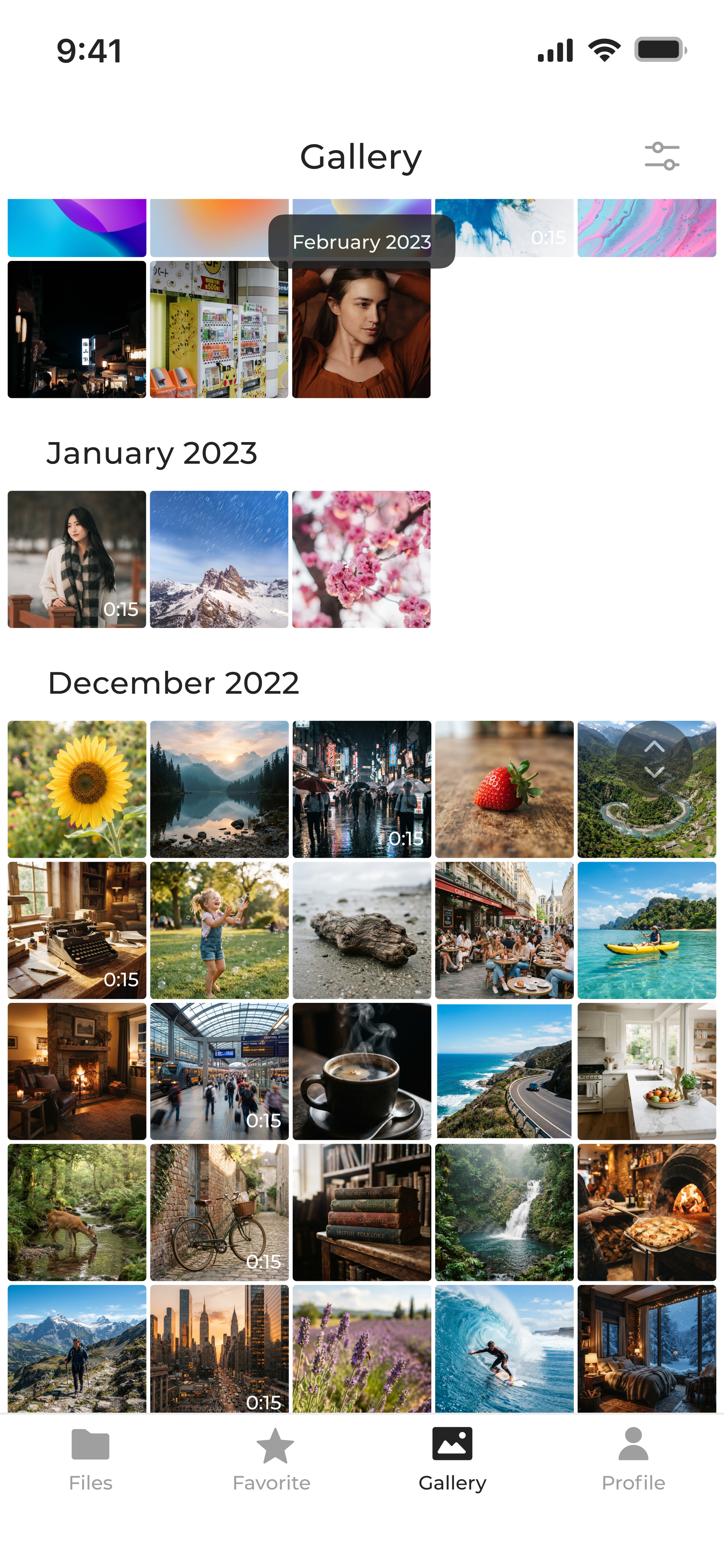
Community & team survey. To get quantitative signal, I ran surveys with both the internal team and the wider community on cloud storage habits. The results: people primarily store media (the large majority store photos, about half store video), and the most‑wanted features were automatic backup and file sharing, a finding that lined up with the competitive audit.
Filling the sample-size gap. Our own active community was too small to draw statistically confident conclusions on its own, so I supplemented it with survey data from five decentralized-storage DAO communities (Arweave, Keep Network, Band Protocol, Ocean Protocol, and Filecoin DAO), roughly 6,000 respondents combined. Together, this data let us prioritize functionality, build out user personas, and settle on a clear product direction: Storage project as a media‑first storage app.
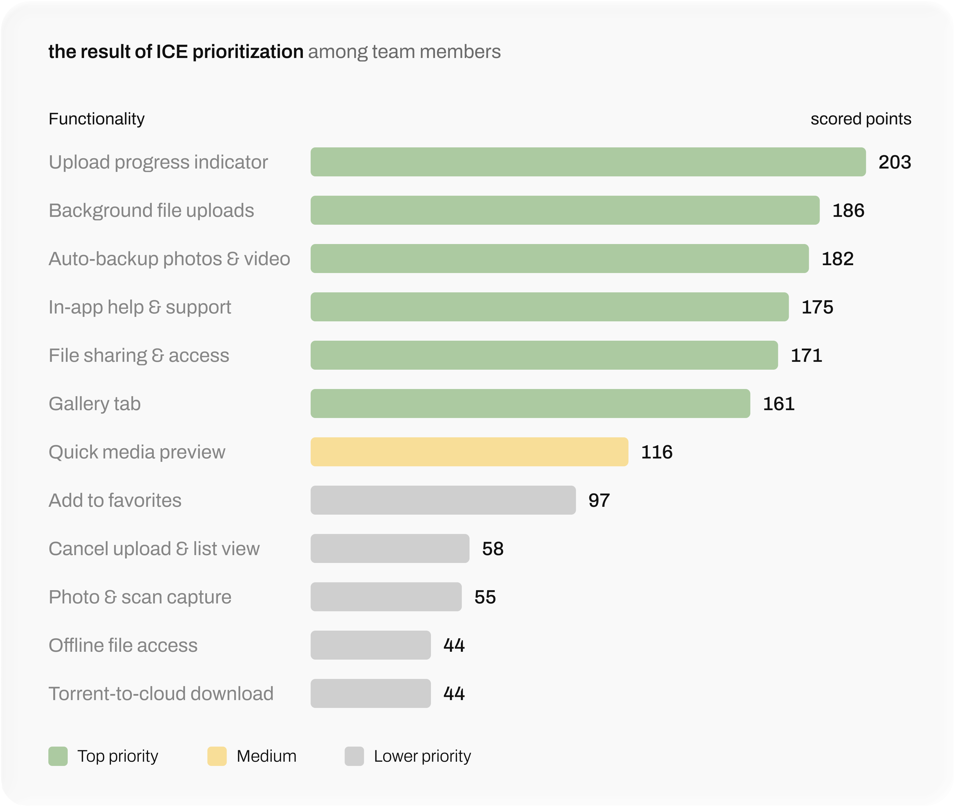
Prioritization (ICE). Every candidate feature went through an ICE pass with the core team, then a second round once engineering weighed in on effort and feasibility, with each surviving item documented with its rationale and expected user value.
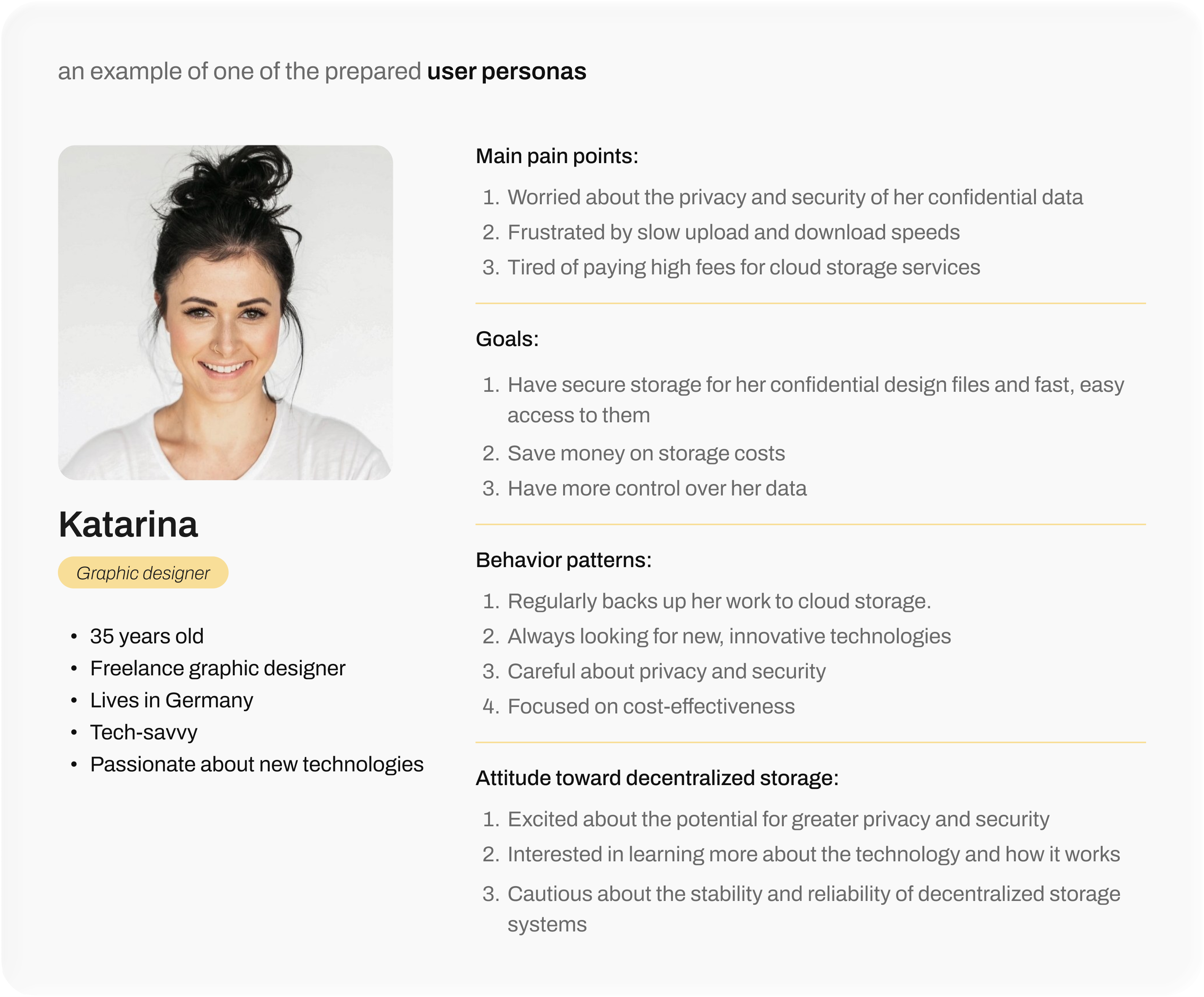
User personas. Based on the DAO community research, I built three personas spanning our likely early adopters: a remote worker anxious about reliable access to his files, a small‑business owner outgrowing his current storage plan, and a freelance designer prioritizing privacy and speed. They gave the team a shared, concrete picture of who we were designing for, how they behave around storage today, and what would get them to trust a decentralized alternative.
Onboarding redesign. Digging into the existing registration flow, I found a specific drop‑off point causing friction, then redesigned onboarding around it, cutting the time it took users to get through it by almost half.
up to 5 screens directly before the registration itself, and creating an account requires manual input from the user, which complicates the registration. The private key needs to be found in the settings, but if you don't save it, all the photos will be lost. There is no description of the key features. On the loading screen for the first file, there is no transition to payment
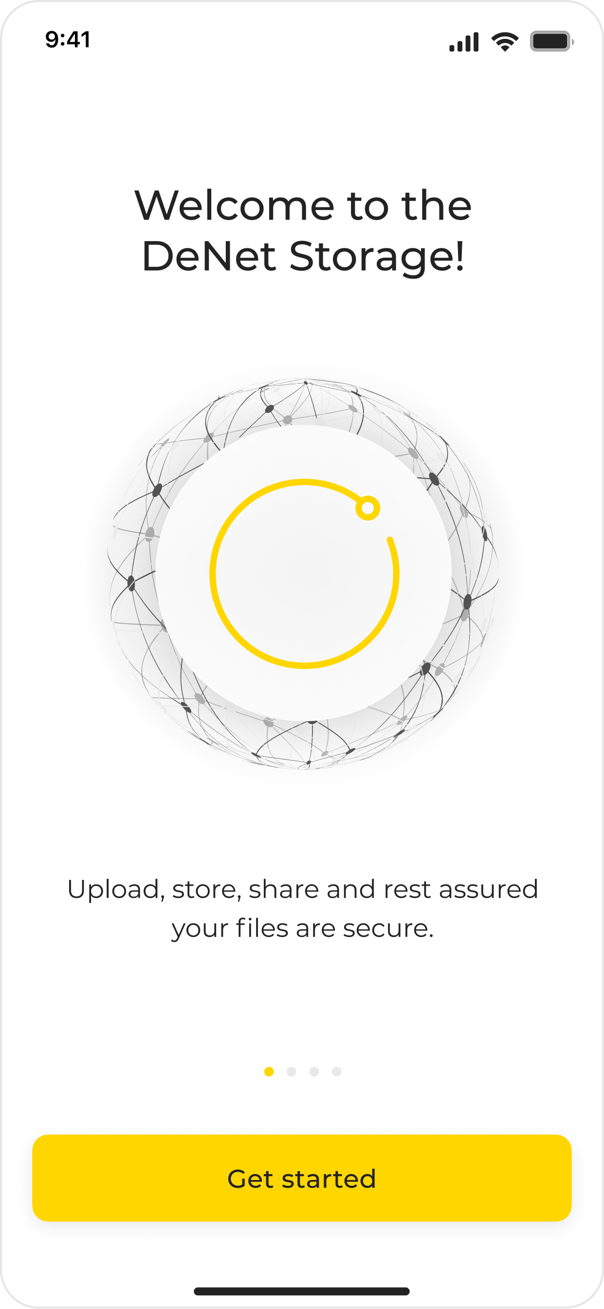
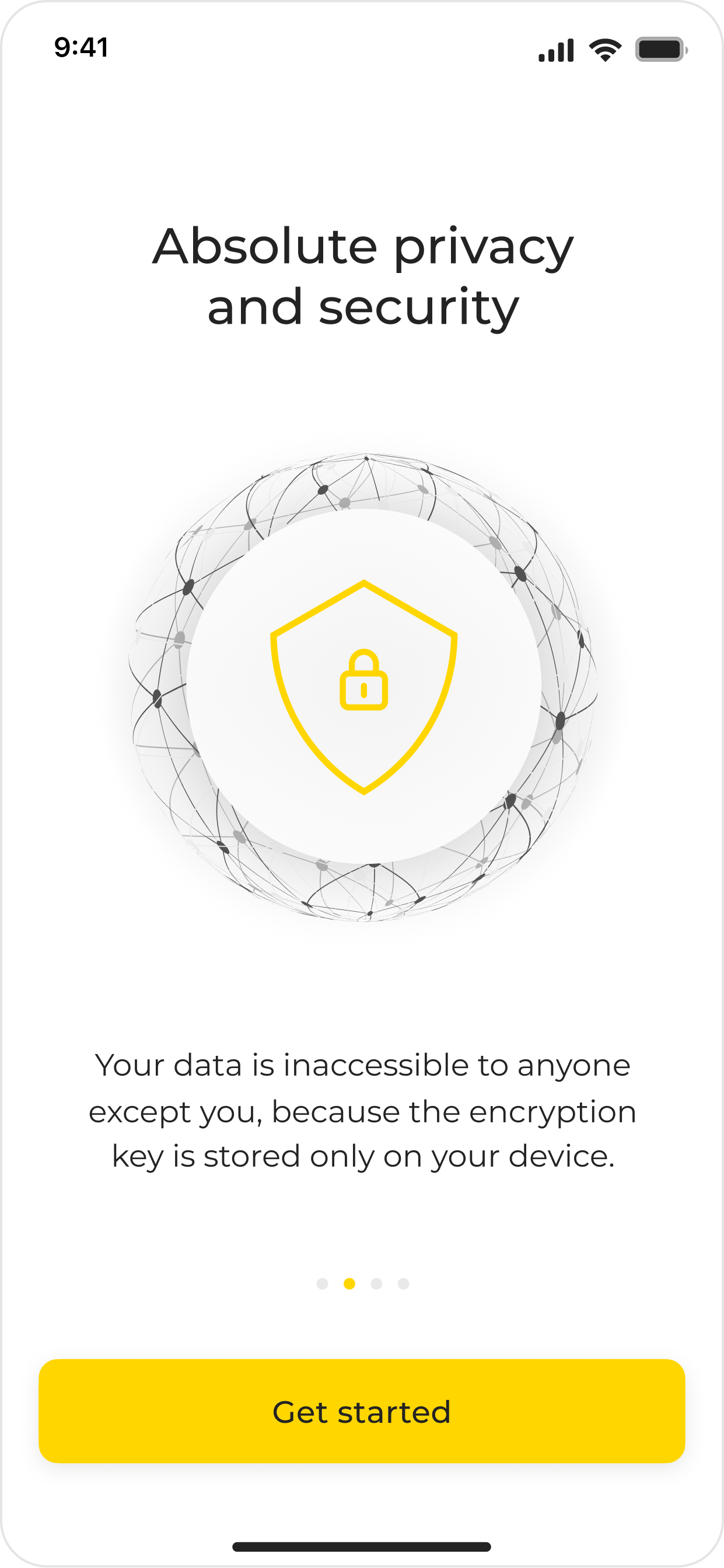
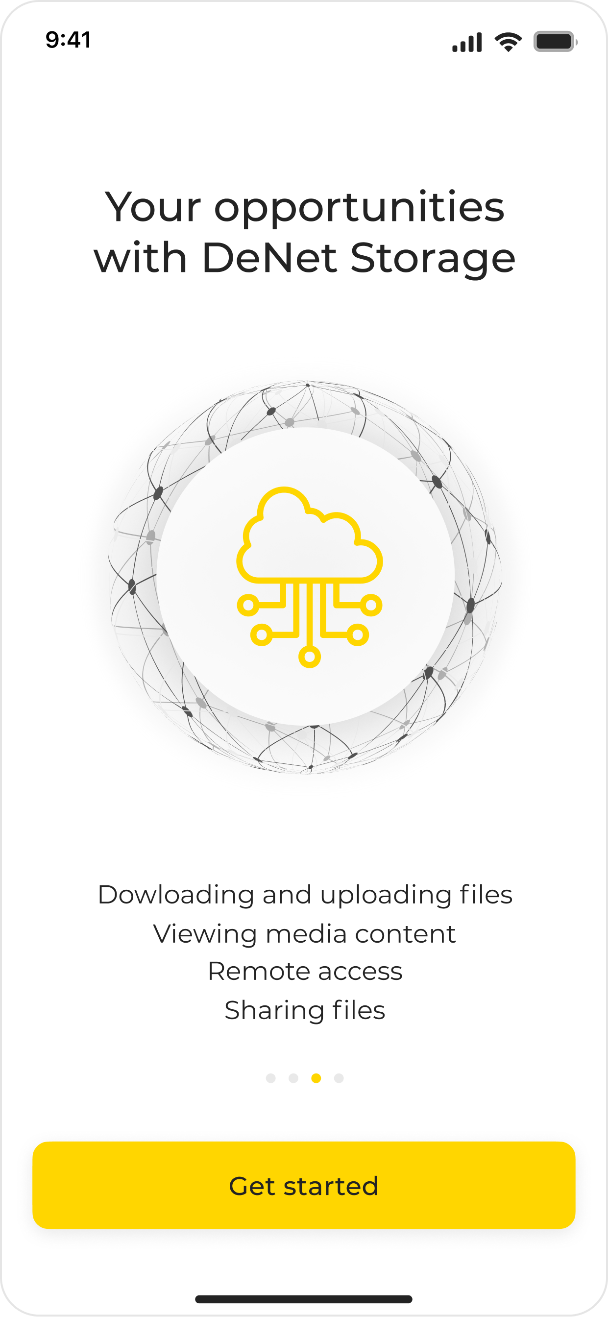
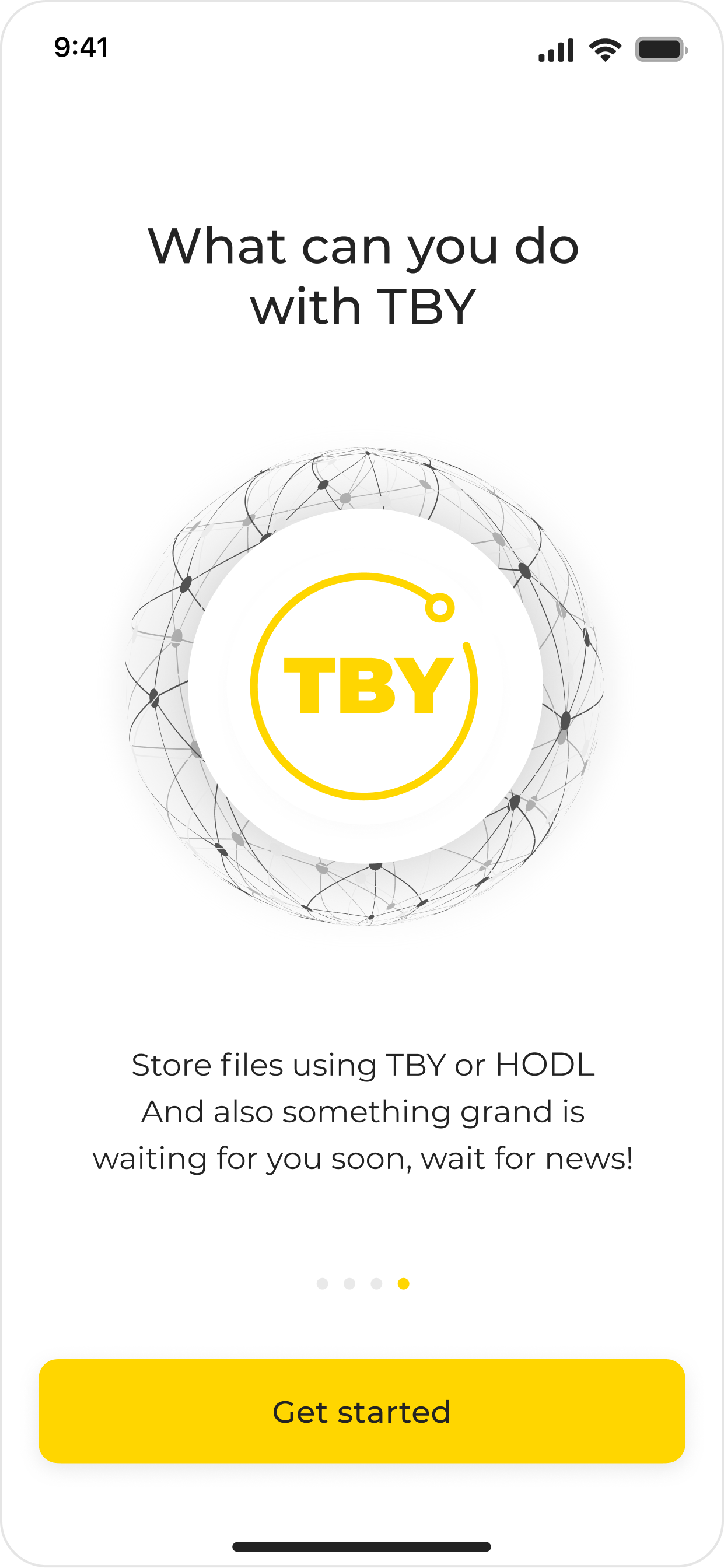
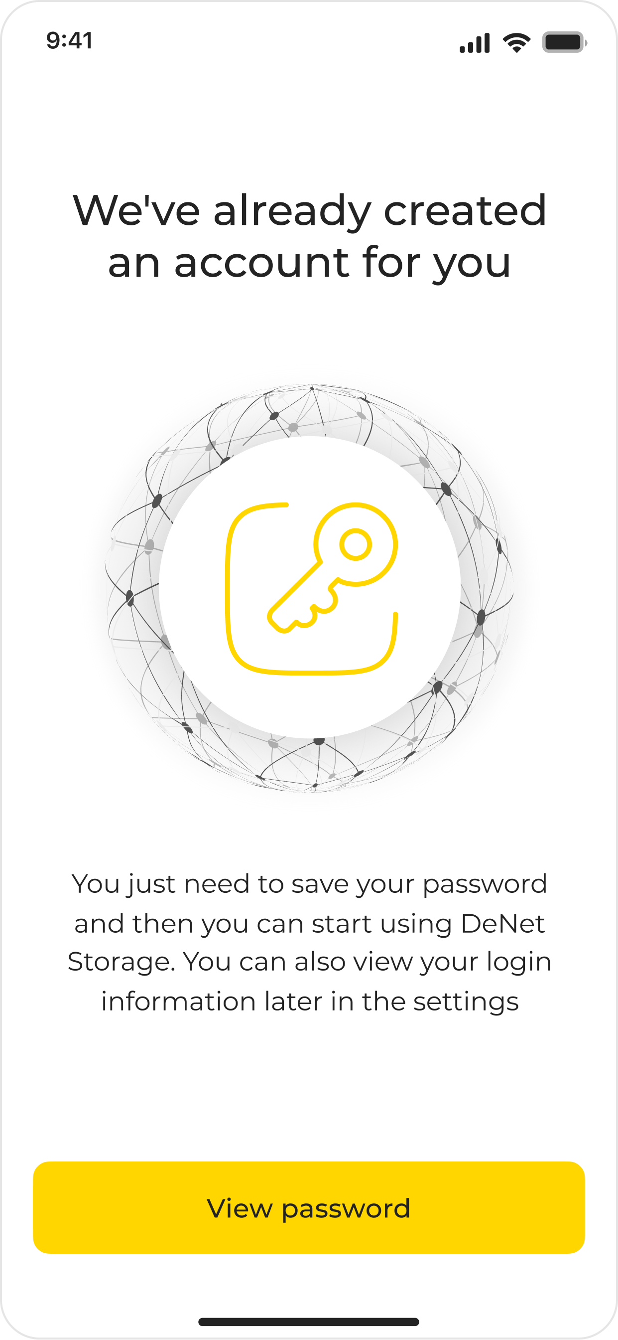
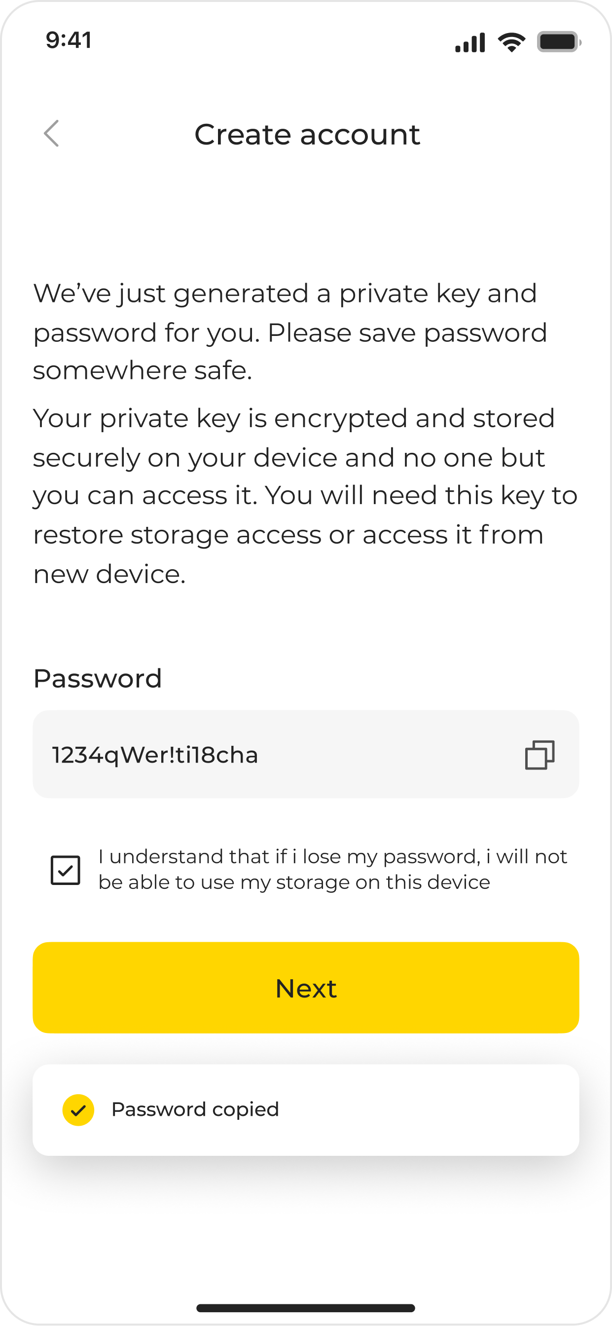
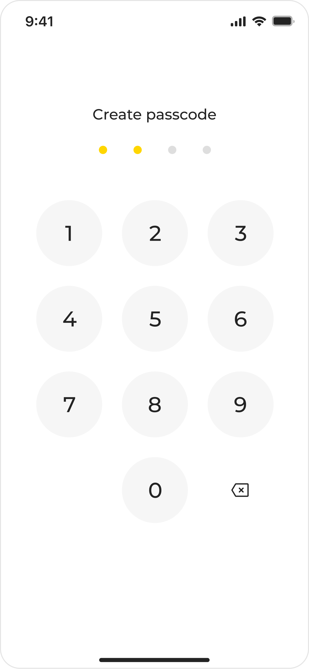
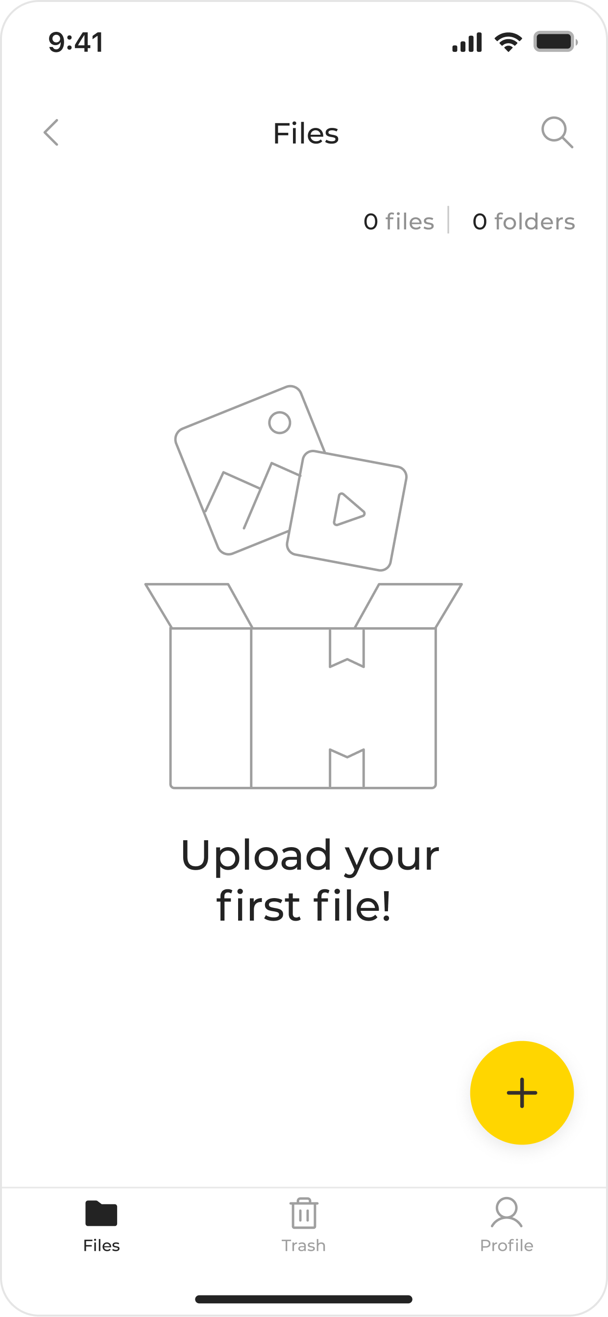
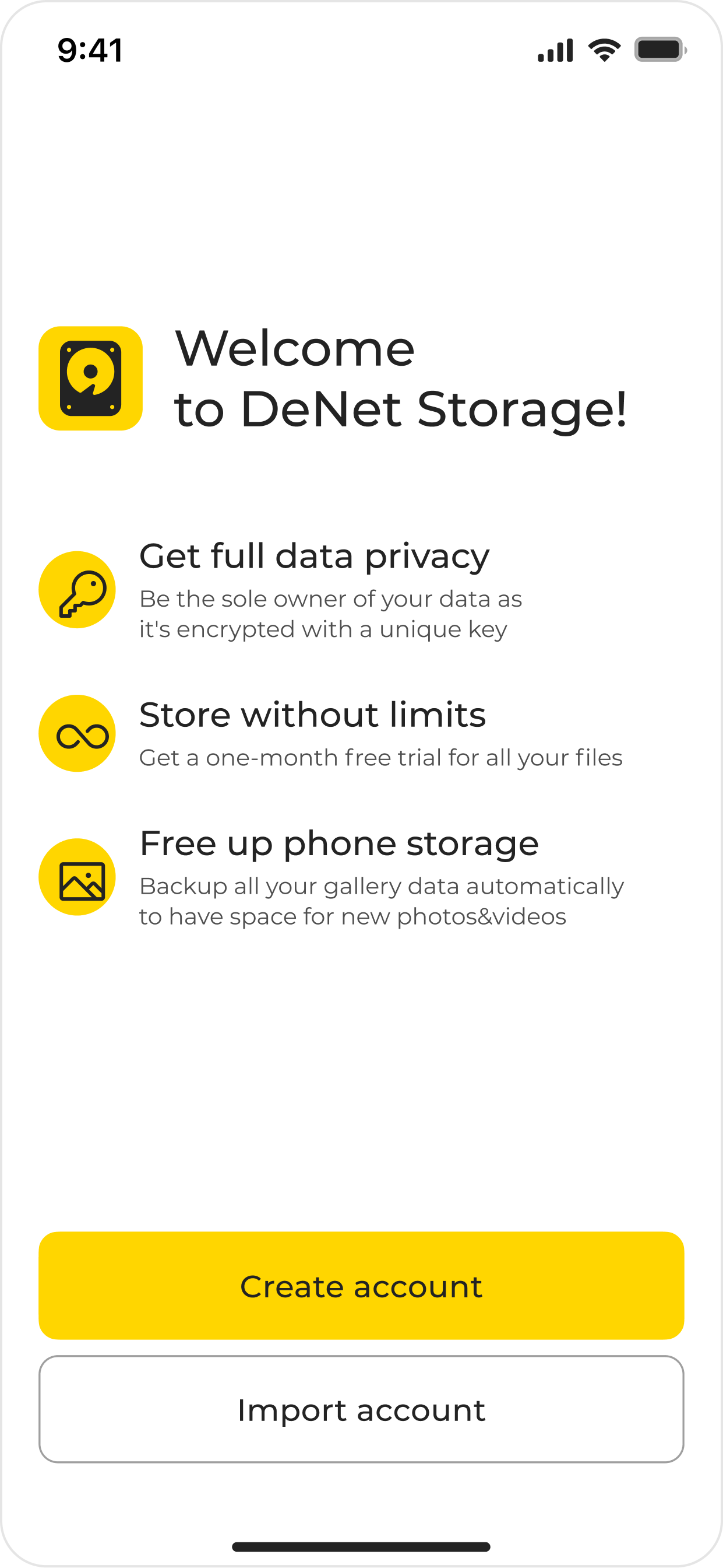
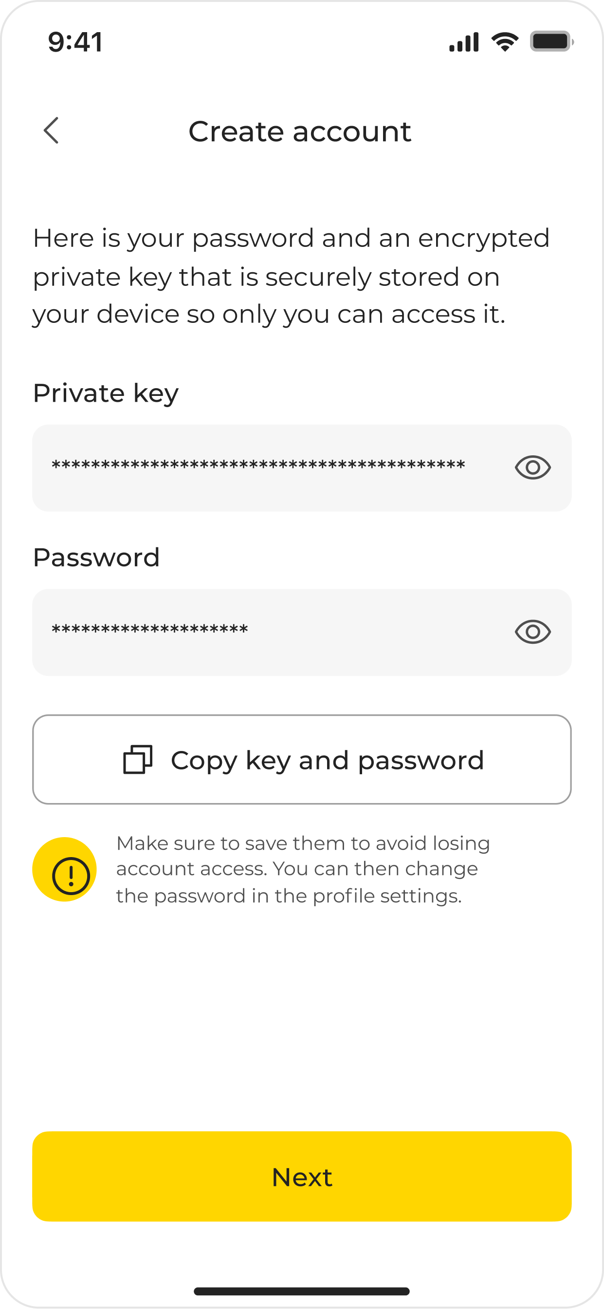
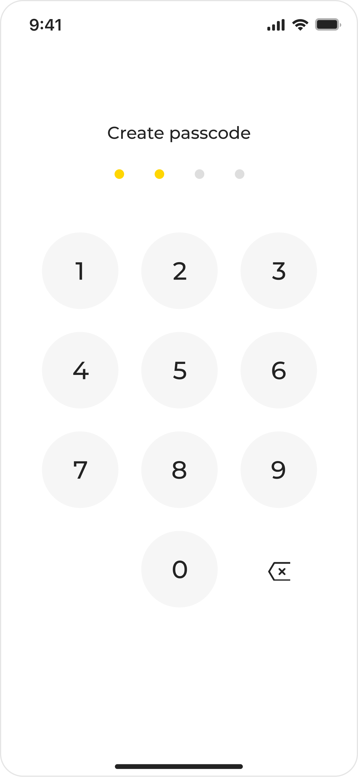
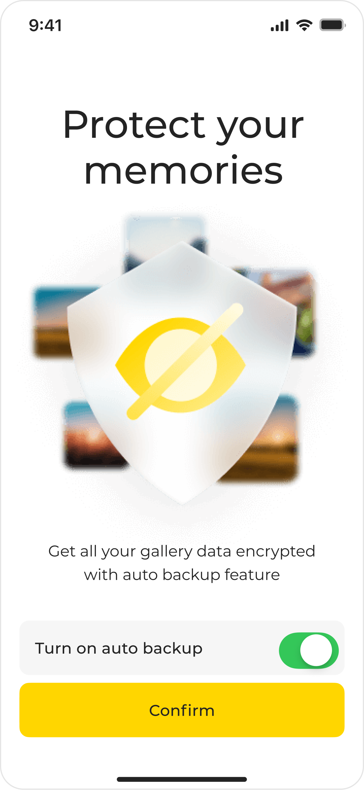
after: all the main advantages are described on the first screen, account creation has become automatic: the user only needs to copy both the password and the private key on one screen. And after the account is created, we suggest using the new auto‑backup feature. On the loading screen for the first file, there are chips for acquiring additional free space
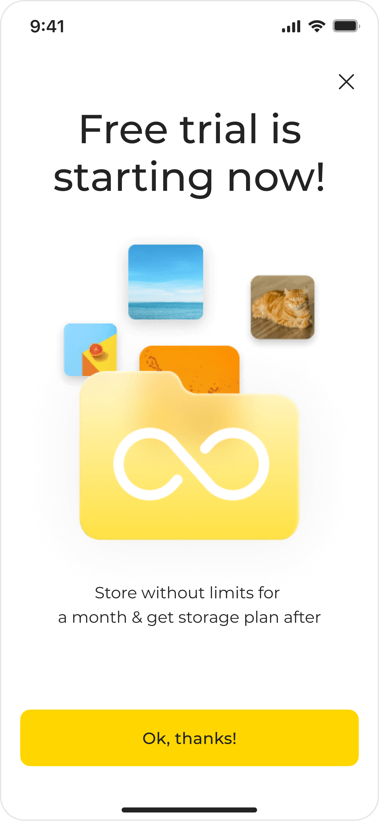
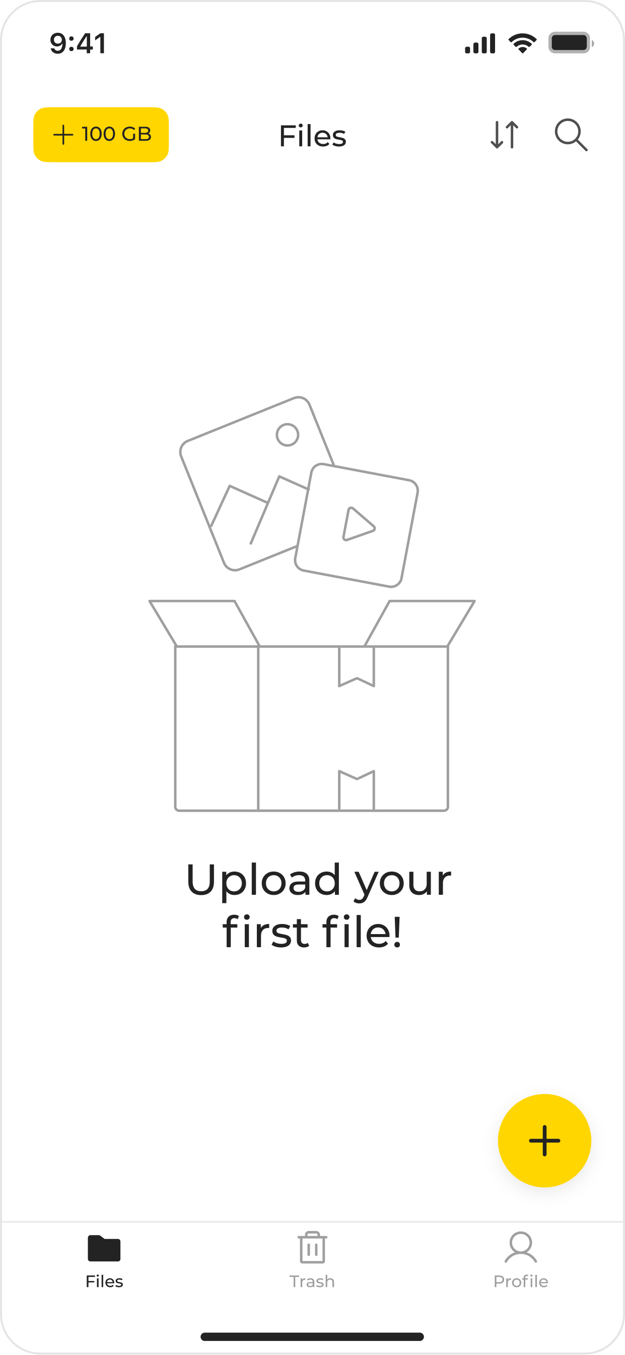
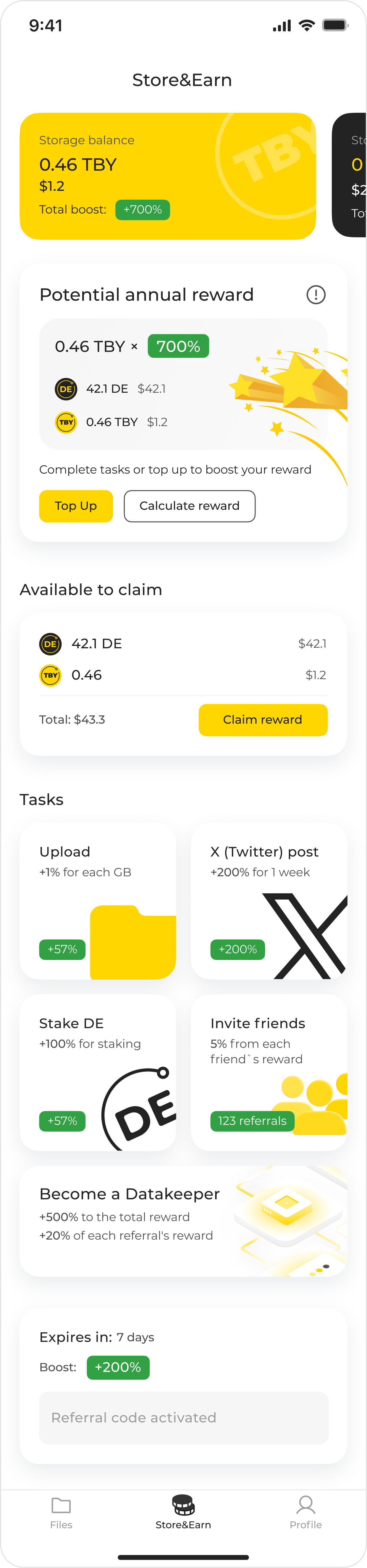
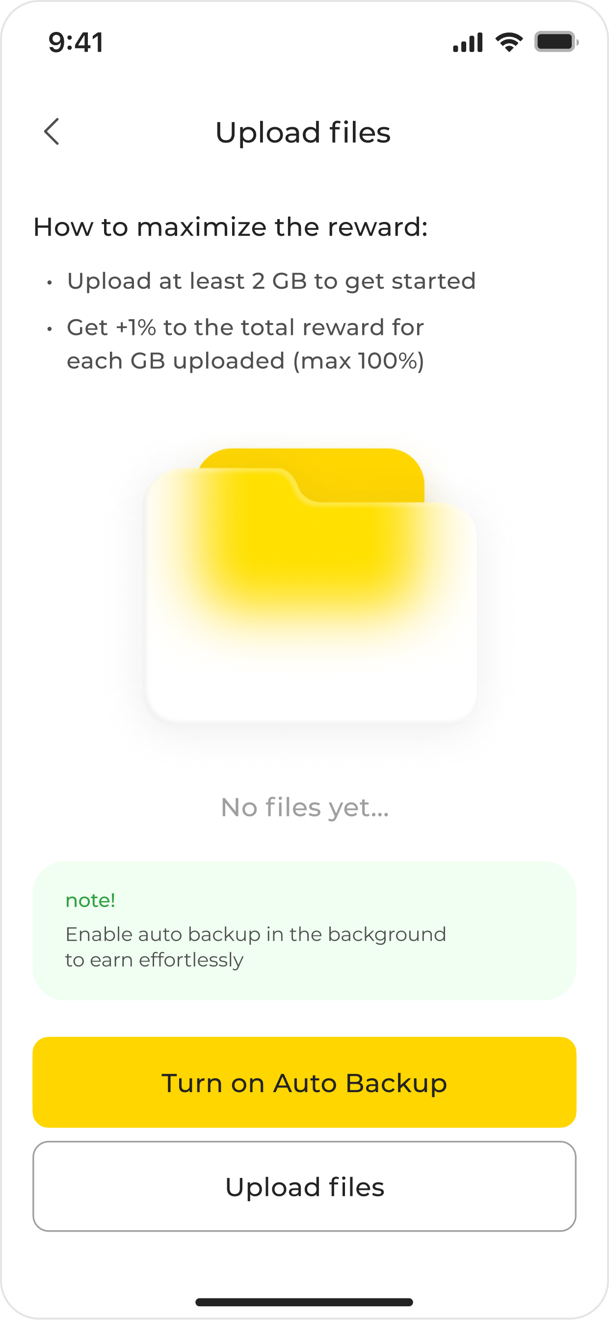
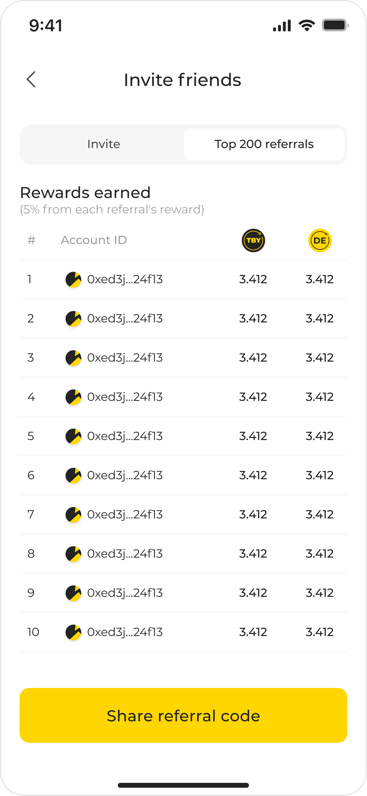
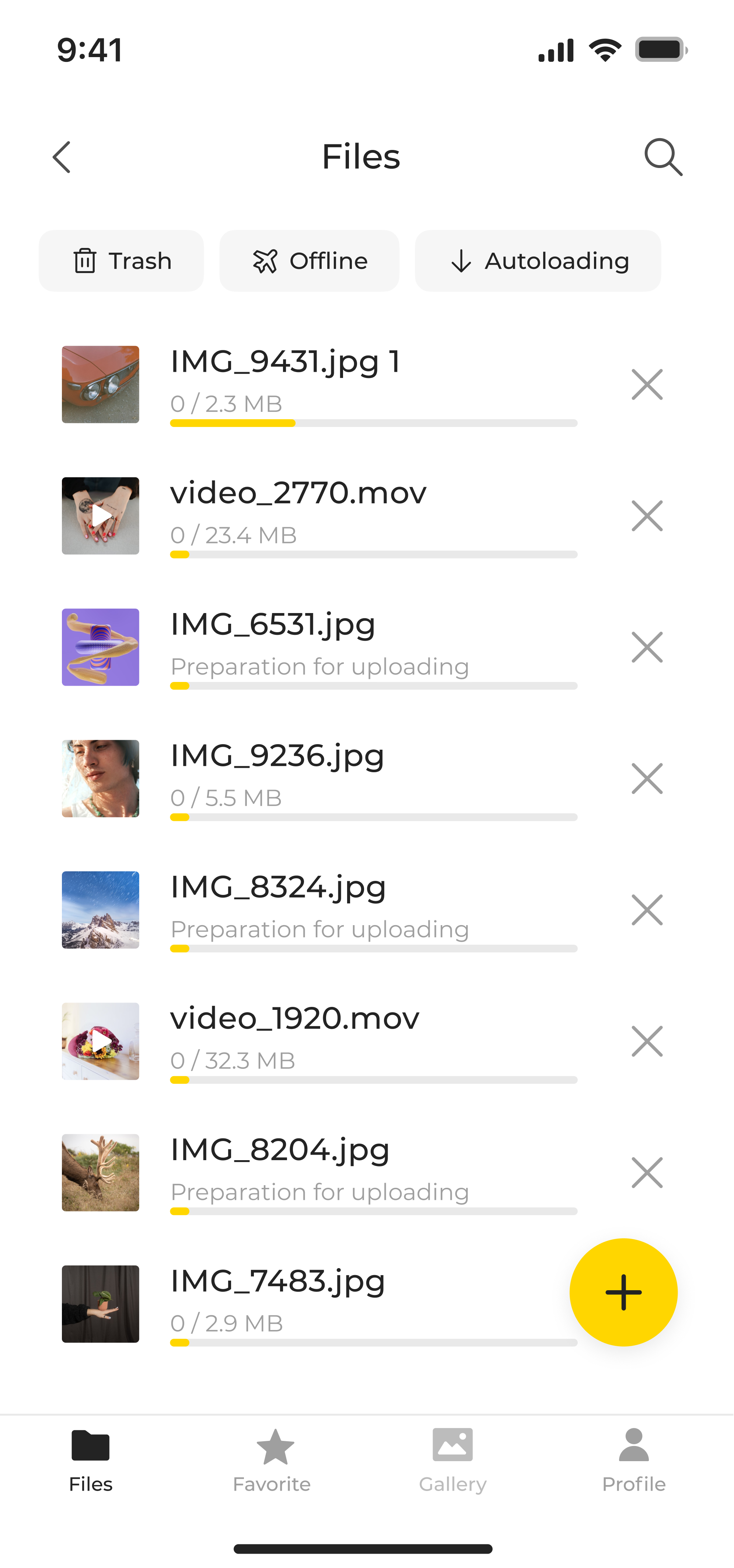
File-upload flow “Store&Earn” Working with the team, I redesigned the core file‑upload flow and designed the “Store&Earn” gamification program that rewards users for contributing storage and provides rewards for small tasks, such as posting on X, which helped to boost marketing efforts, among other things. It drove over 200 TB of uploads to the network's nodes and a real lift in user activity, which helped push the token price up and delivered the business's first profit
the main Store&Earn dashboard and a few examples of tasks
Usability testing. For the crypto‑payment scenario, I ran corridor usability tests on Maze.
What was analyzed:
- time and percentage of successful completion
- which screens caused the most difficulties and were perceived incorrectly
The signal was blunt in places: one screen scored just 1/100 on usability, with 56% of testers misclicking and an 18‑second average completion time. After redesigning and retesting, the reworked screens in that flow scored 82-85/100. Screens that didn't clear the bar were rebuilt and tested again until they did
a clear example of where usability was clearly lame
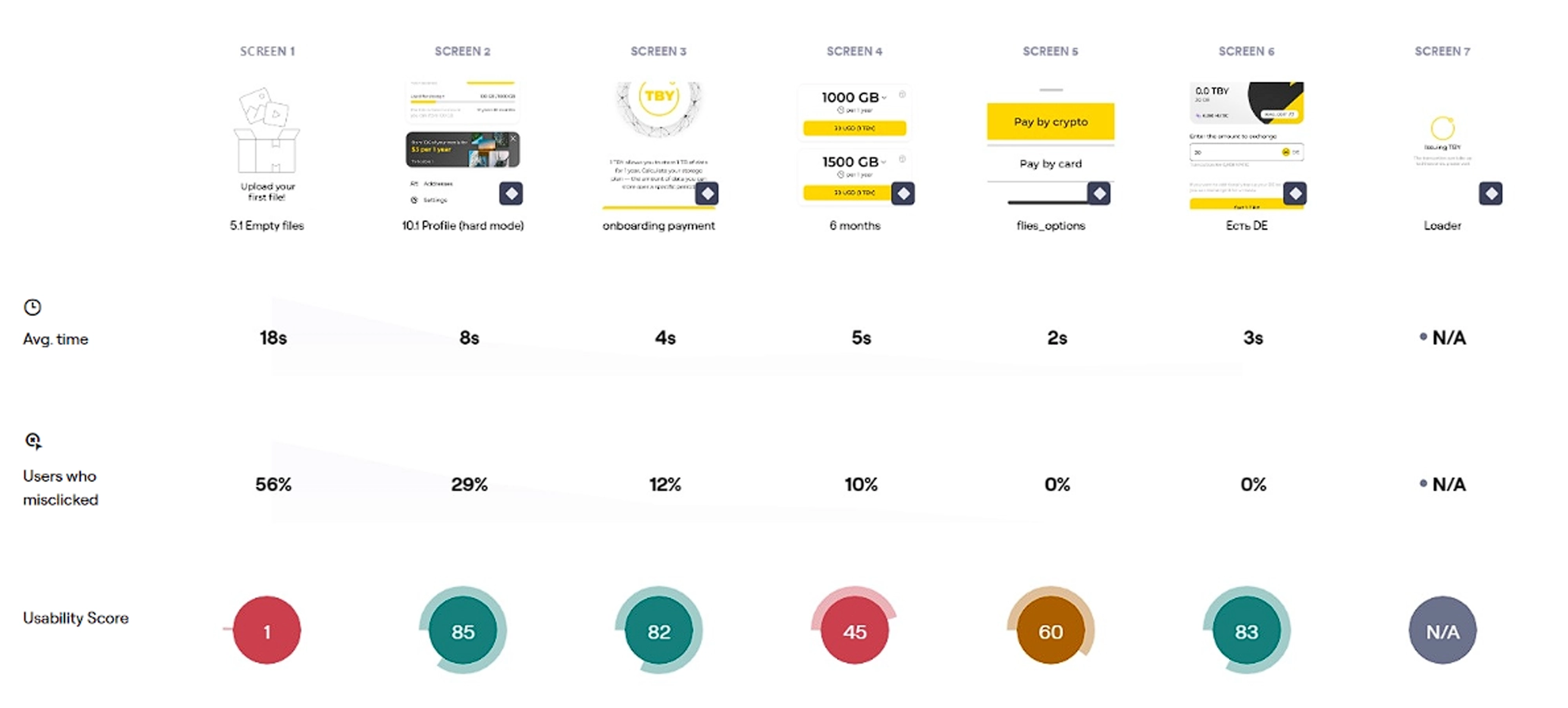
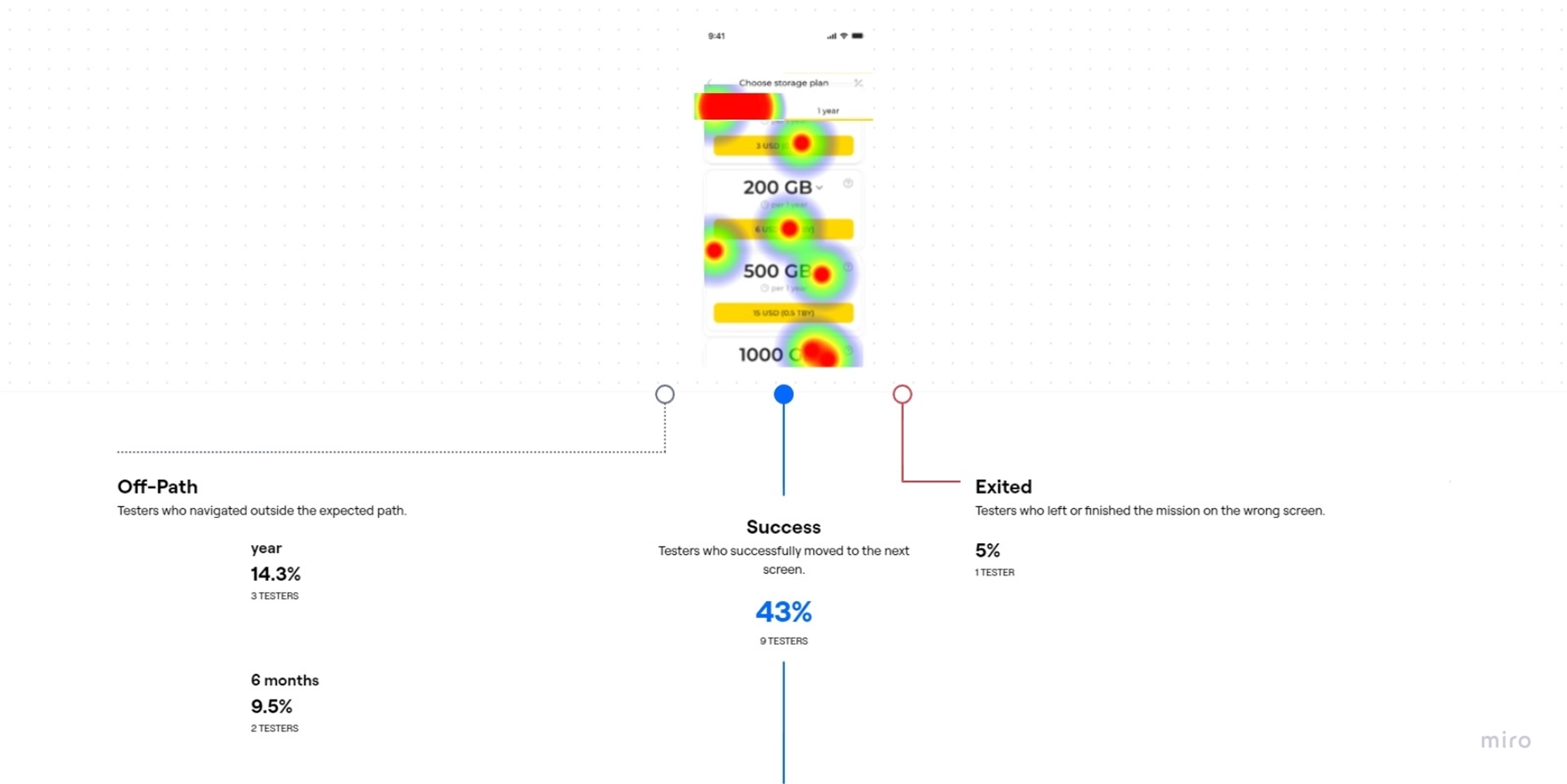
looked at which screens were the most difficult to complete
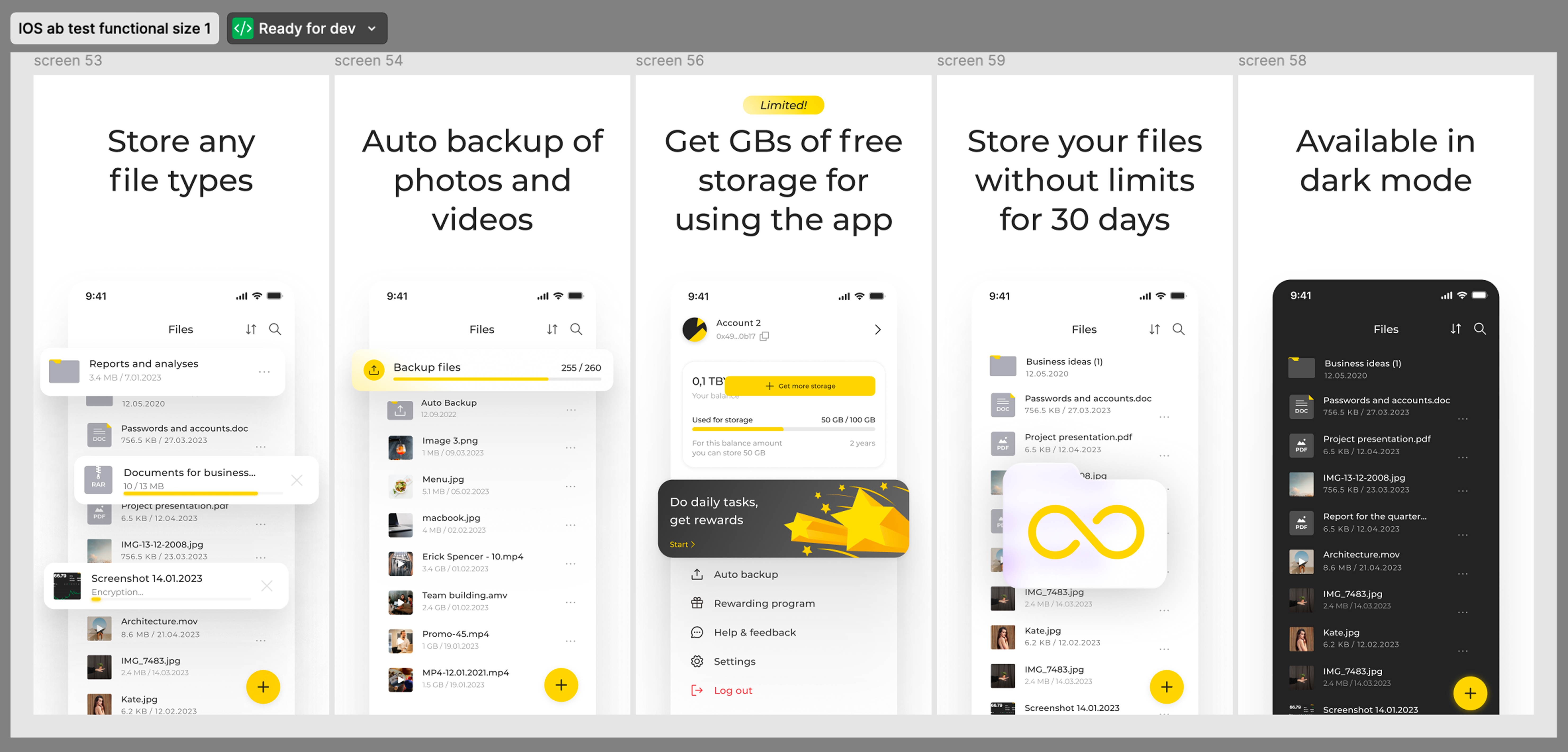
in addition to usability tests, a number of A/B tests were conducted

Redesigned the file-upload flow and built the “Store&Earn” gamification program, which drove over 200 TB of uploads to the network's nodes, pushed average upload volume to the program's target of 100 MB per user, and lifted user activity enough to help push up the token price and deliver the business's first profit
Found and fixed a drop-off point in registration: the reworked onboarding cut completion time by almost 2x and grew the share of users uploading their first file, moving the needle toward the program's 30% target
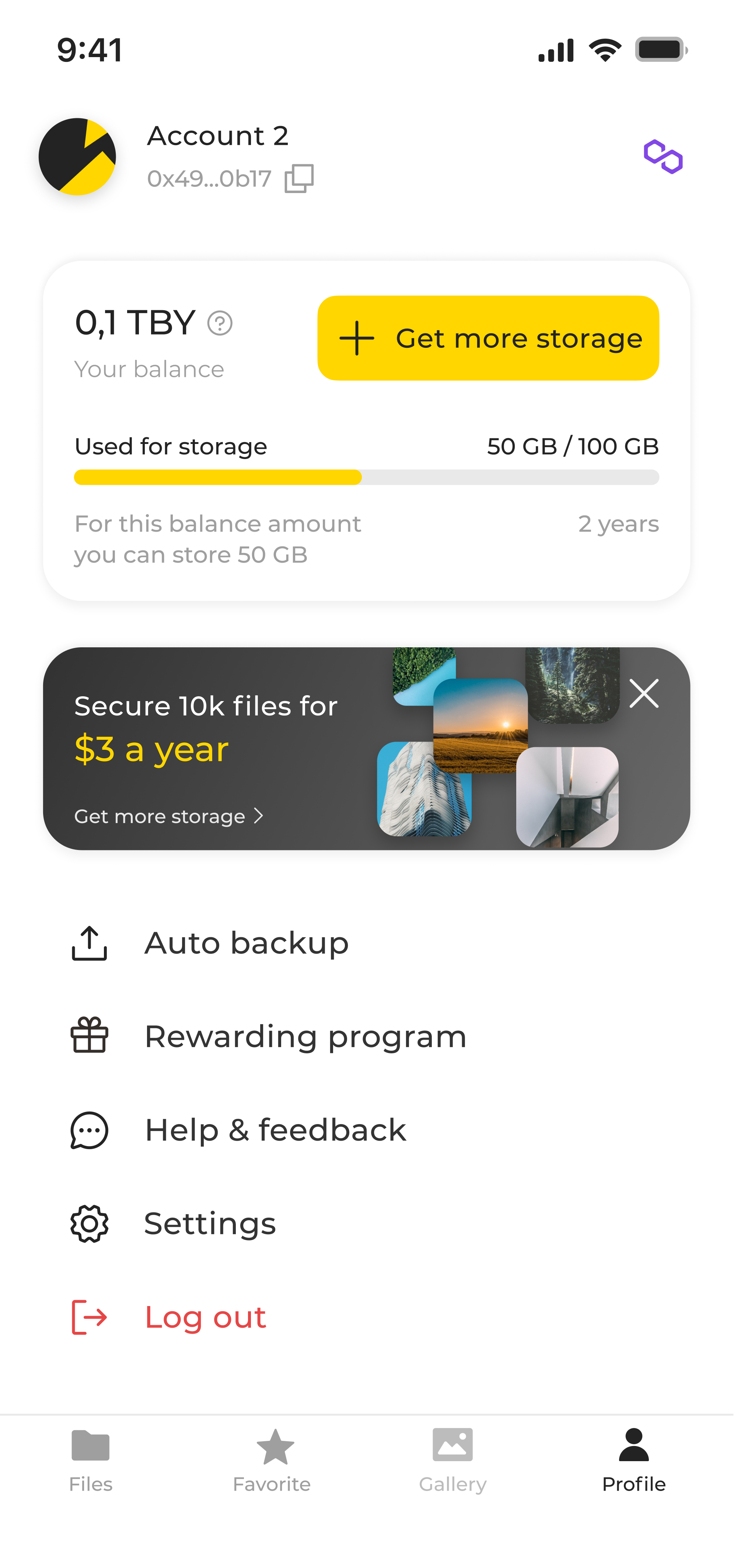
Refreshed the mobile app's UI kit, speeding up the assembly of new screens and keeping the product visually consistent
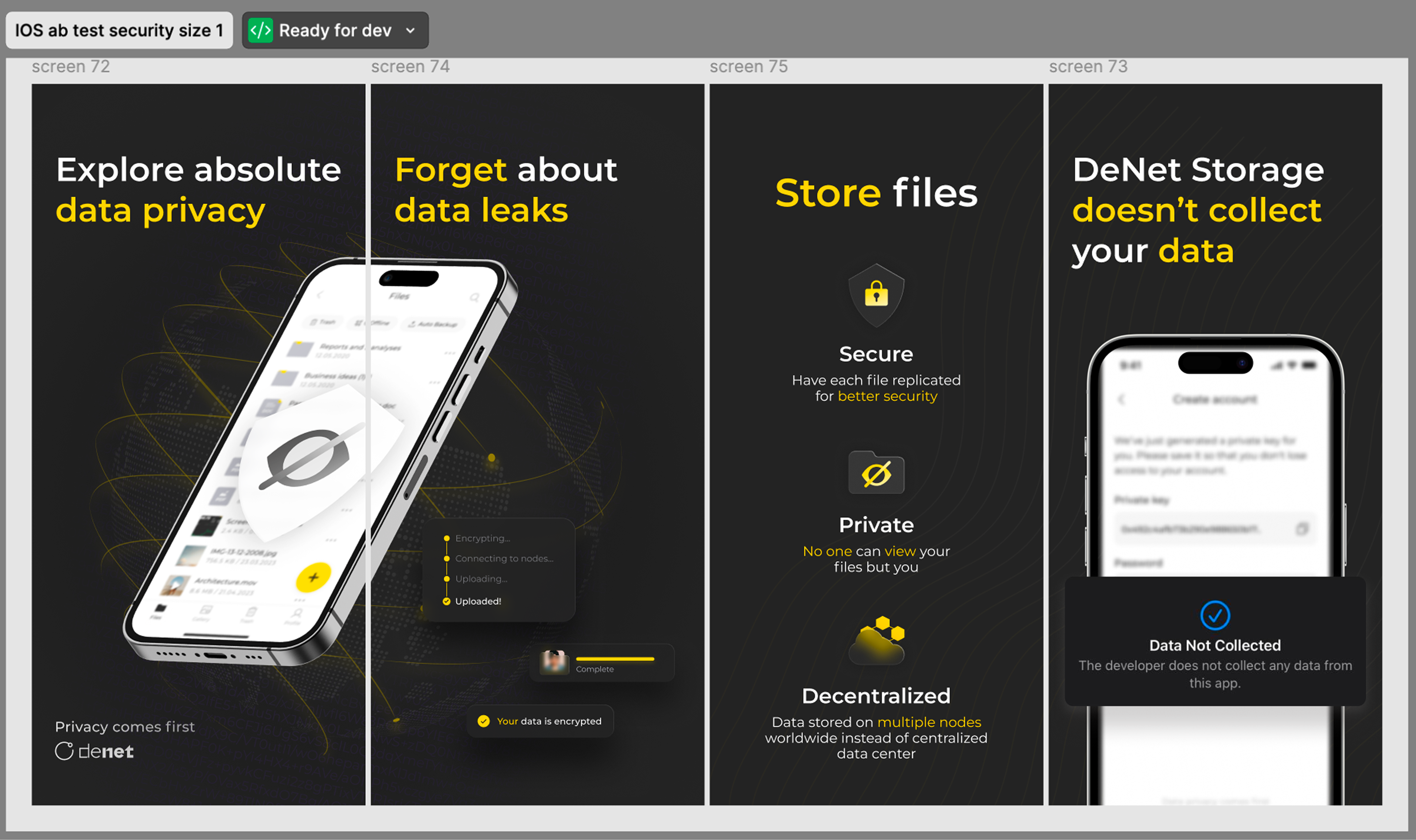
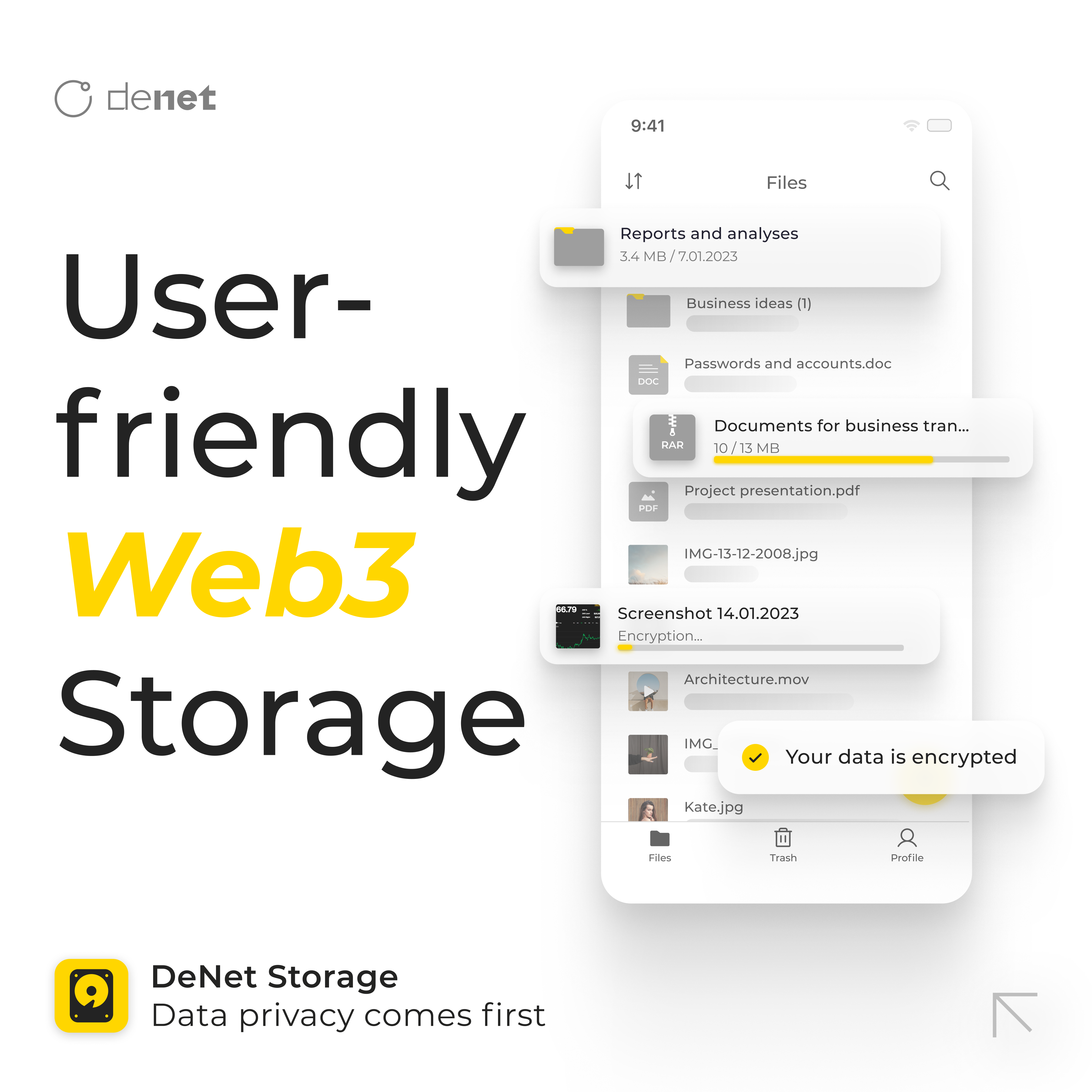
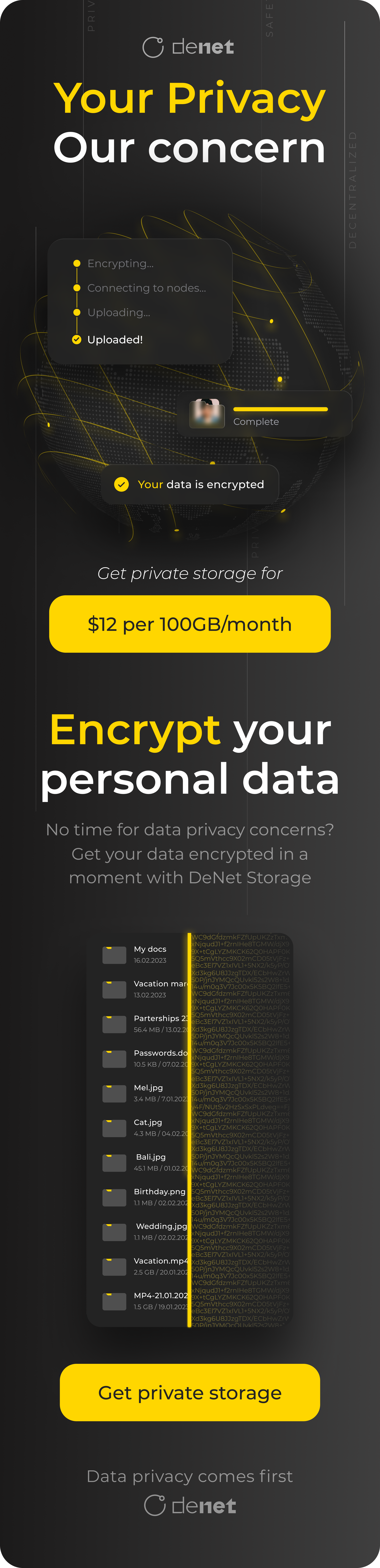
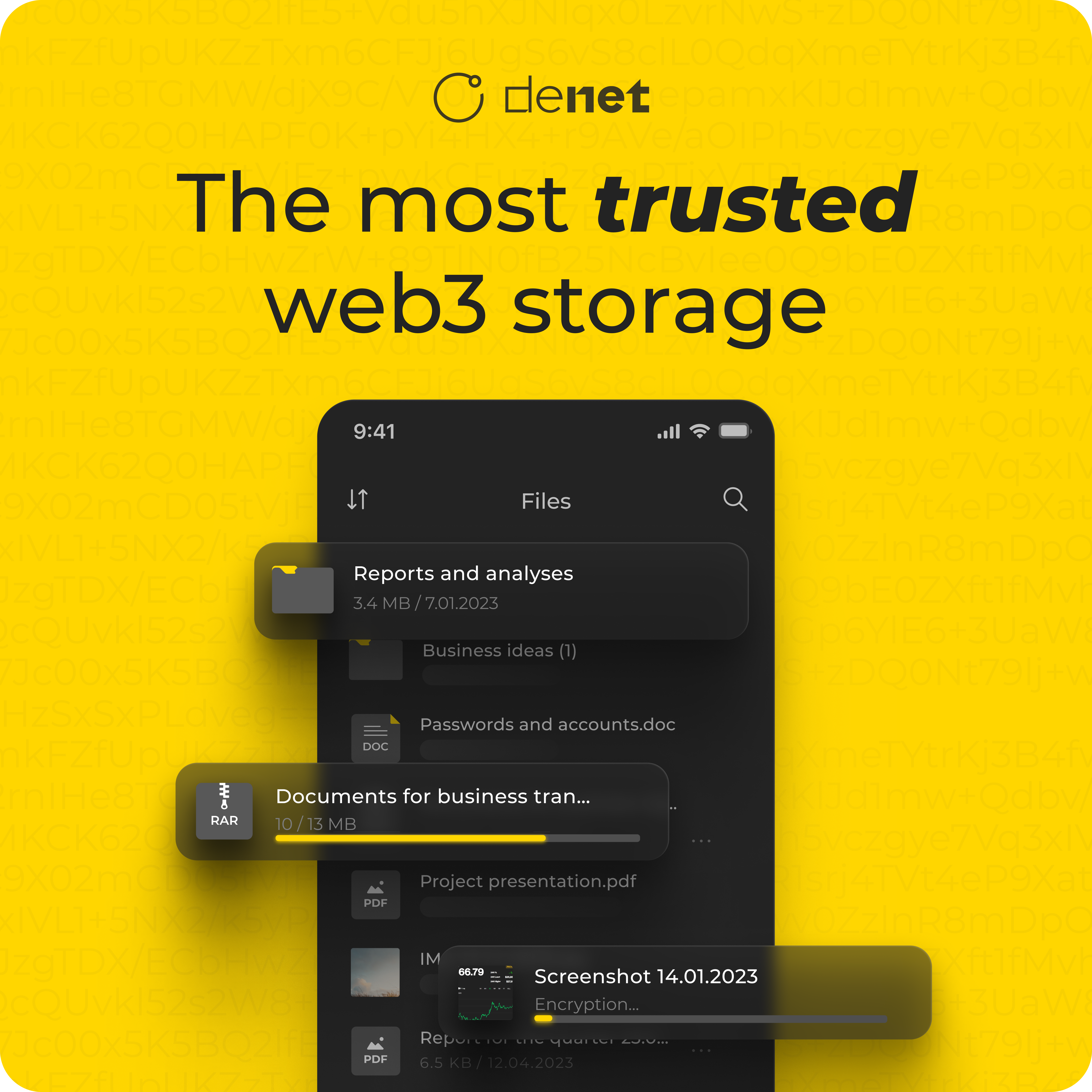
Marketing & growth design. Beyond the product, I designed landing pages for paid campaigns and produced graphic content: posters, illustrations, social assets for Instagram, Google Ads, and the project's Telegram channel, to help build visibility for the project

A few honest misses, and what they changed about how I worked:
Underestimated implementation complexity. Some features turned out to be far more work for engineering than expected, pushing back timelines. Now I stress‑test complexity together with engineering, on a call, before committing to scope.
Followed a founder brief without checking it against the audience. We designed and tested a full crypto‑payment flow, only to realize our actual users (mostly acquired through Google Ads) had little use for it. Design and testing time went into a flow that didn't matter to the people using the app. Now I validate that a feature is actually needed, at every level, before designing it.
Designed too many features in parallel. By the time some screens reached implementation, new research had already made them outdated, so they had to be redone. Now I work iteratively and stay only slightly ahead of development.